No matter who we are or where we’re from, colours alone have the ability to communicate faster and more powerfully than words. Joseph Addison articulates this with beautiful simplicity: ‘Colours speak all languages’.
We don’t need to go far to see how using colour in our design work can cut through noise, command attention, and engage meaningfully. We see this on our grocery shelves with certain products that pop out to us, magazine spreads, book covers, thumbnails on websites, and even app button icon designs. Studies have shown that we’re drawn to the colours that trigger emotions most relevant to our desires and perceived needs.
Early in my design career, when I first started working full-time in 2005, my design process was much different than it is now. Back then I selected colour palettes for my layout designs before selecting the images I was going to use. Gradually, this started to shift in reverse. Now, more than ever, I select images first and form a colour palette based on that image set (while aligning with the communication objectives).
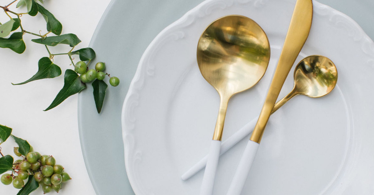
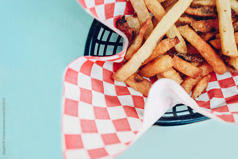
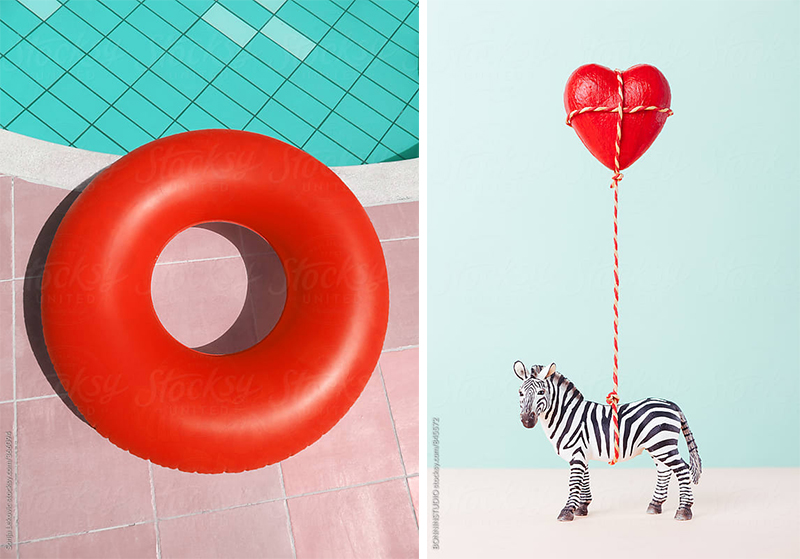
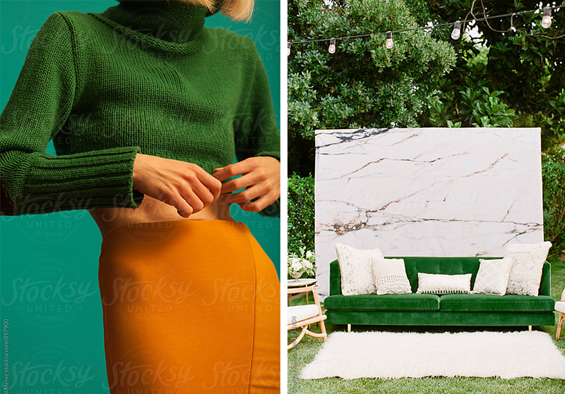
Below is a collection of Stocksy photos that can give you an indication of the type of colour palettes you can begin working with.
Plus, Stocksy has just released a new visual search ‘drag and drop’ tool. No need to type in specific keywords. I expand on this towards the end of the blog post article, to assist you further.
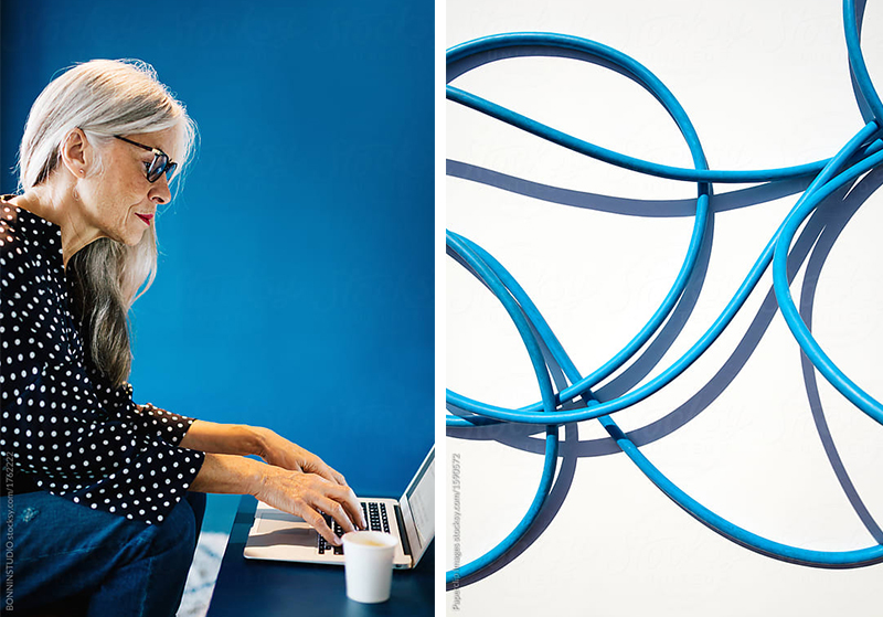
Example ideas for use:
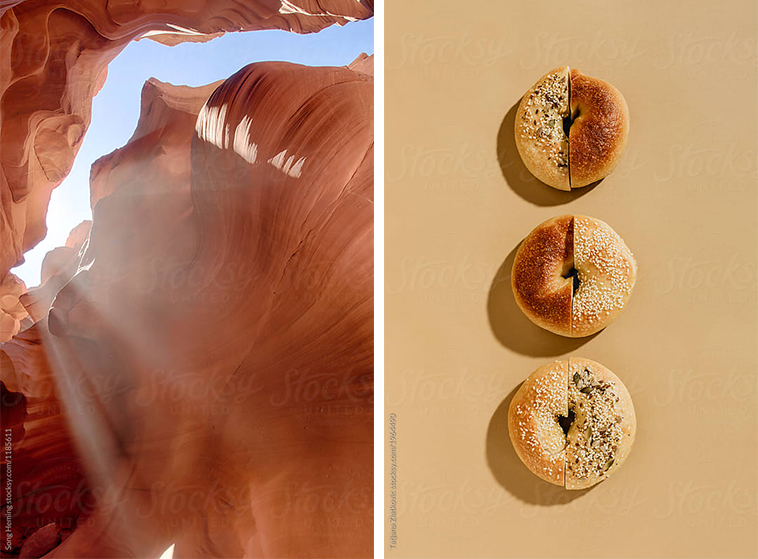
Example ideas for use:
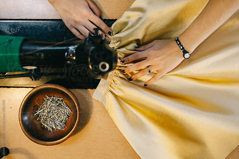
Example ideas for use:
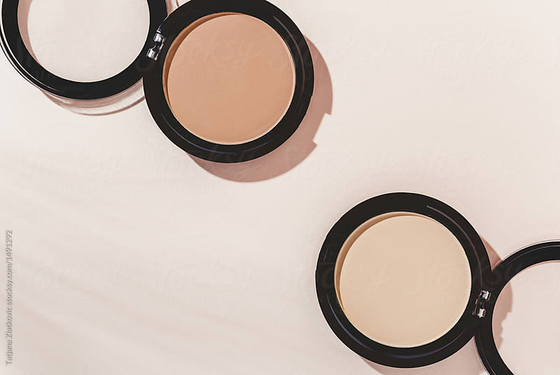
Example ideas for use:
Bonus tip: ‘drag and drop’ any image (Stocksy-based or not) and immediately get 150 impressive, related photo and video results.
Yep. We’ve all been there. That one image that hits the brief and then you spend hours trying to find something similar. You tweak filter options, customise keywords, look through dozens of pages and websites — only to find something potentially close but still not right.
Stocksy solved this problem. No need to type anything. Drag your preferred image anywhere on the Stocksy website and it will automatically recognise the subject matter, style, colour palette, environment etc, and curate the best selection of matching assets.
Conclusion
This process of rapidly selecting Stocksy images and grouping them into colour palette categories based on mood and emotion is powerfully efficient. The goal is to reduce the time gap commonly wasted on deciding on a colour palette (often to only to find that there aren’t any suitable images for the design deliverable). To help you get started and take advantage of these features, Stocksy is generously offering all Giant Thinkers readers and listeners 15% off all images – which I’m truly grateful for. It’s hands-down the best image and video library that I’ve encountered. So I encourage you to take this opportunity to have a browse and see what they have to offer.
To access the 15% off discount, click the link below and it will automatically be added to your cart.
GiantThinkers.com/StocksyColours
Let me know how you go! I’d love to see what you create based on the above (whether it be visual communication that’s online or offline).

One Response to Using Stocksy photos to direct your colour palette